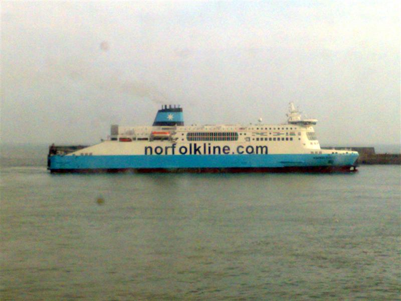
There's one downside to being involved in the design world, and that is having an unavoidable eye for details..
Give me a menu at a restuarant and I will be mentally cringing at the 7 different typefaces and lack of design consideration that has been given to the main piece of communication between the restaurant and the customer before I can even try and take in the actual offering.
Flyers drop through my door, and I cannot help myself but note how if the vendor had just spent a few moments thinking about their ideal audience and then a few pounds having the communication designed appropriately it might have hit a mark (before I then drop it in the recycling bin) It will therefore come as no surprise that this typographical abomination caused me to squirm uncomfortably until it had passed out of view. What was interesting on this occasion was that my travelling companion (who by his own admission is to design what Jade Goody is to haute couture) spotted my flinches and acknowledged the heresy that was evident outside the ferry window immediately and required no convincing that this was not good brand portrayal and he too read it as "Norf-olkline" as the font metrics are completely wrong. (it acutally looked worse, if that is possible, outside the lens of my camera as the kerning between the o-l-k is also all wrong)
Norfolkline must be aware that this particular ferry has been "decorated" in such a way, but I am intrigued as to how it came to be so - it surely cannot be down to cost-saving, though I can understand that could be why it has not been corrected since. Maybe there is an opening for a position as Brand Manager!?
Ok, so, in the scheme of things and in comparison to world peace and global warming, this hardly needs a mention, but my point is that, with a small amount of care, the right communication to the contractors doing the painting, or a tiny amount of education as to what the company's brand stands for, this would surely have not happened?! I know that it's not what's on the tin, but what is in it, but we dont buy premium baked beans from a dented, scrawled wrapped can, do we..?
If a company cannot look after their own brand or present their products and services to to the best of their ability, how am I supposed to feel that they will they look after me as a customer?
Monday, 21 April 2008
look after your brand
Posted by
nickbroom
at
8:14 am
0
comments
![]()
![]()
Labels: branding, communication, customers, design
Tuesday, 1 April 2008
Talk WITH your consumers - or else!
Whatever size company you are and whoever your customers, clients or consumers are, you have to take note! We, as consumers are fed up with being talked AT, the relentless PUSH process from advertising that results in little or no dialogue whatsoever and certainly is rarely a two-way street.
Those that get it right, and engage with their audience with honesty and integrity, are already showing signs of getting results, and it works no matter the size of your organisation . Who looks after your customers, who REALLY looks after them? Marketers talk about CRM systems and customer DATA, where we are all neatly stored and categorised for the benefit of the supplier..
..but we dont want to be a meaningless number, in fact, we dont want to be categorised - we want to feel valued and er, well, loved! Then we'll come back and buy more of your products and services, tell our friends and recommend you, tell you what it is we love about your products and how you can improve or develop them, all valuable stuff that you will struggle to get accurately through any other means.
Here's a fantastic portrayal of this issue, does it ring any bells with you?
Posted by
nickbroom
at
11:00 am
1 comments
![]()
![]()
Labels: branding, communication, customers, social web, strategy
