Here's an interesting viral brand campaign. Orange have commissioned this fantastic social media project where you can race a balloon across internet miles and the winner gets a VIP trip to Ibiza with some mates.
The graphics and execution of the race are superb, and the team at Poke have done a great job on it, though I think it is seriously aimed at techies as there is little instruction on how the thing actually works for the layperson. It feels like they got so caught up in the clever trickery of making it all work that someone forgot about the user experience as there is little to help you through some of the registration and starting stages - it seems to assume you already know how it all works already?!
However, an innovative viral concept from which Orange get a rich stream of prospect data and huge amount of brand presence in exchange for interraction with a truly innovative and fun application!
You get to choose a balloon, then steer it over websites along the course (that you can also submit, so other balloons can visit your site, too) and friends and contacts can give you a boost to help you on your way.
We've joined the race, so search out the "preview" balloon and give us a boost! You can see the progress of our little blimp in the panel on the right of this blog.
Hurry, there's less than 6 days to blow our sleek dolphin (yes, I did that on Porpoise!) balloon along!
Thursday, 26 June 2008
The Orange Balloon race is on!


Monday, 21 April 2008
look after your brand
There's one downside to being involved in the design world, and that is having an unavoidable eye for details..
Give me a menu at a restuarant and I will be mentally cringing at the 7 different typefaces and lack of design consideration that has been given to the main piece of communication between the restaurant and the customer before I can even try and take in the actual offering.
Flyers drop through my door, and I cannot help myself but note how if the vendor had just spent a few moments thinking about their ideal audience and then a few pounds having the communication designed appropriately it might have hit a mark (before I then drop it in the recycling bin)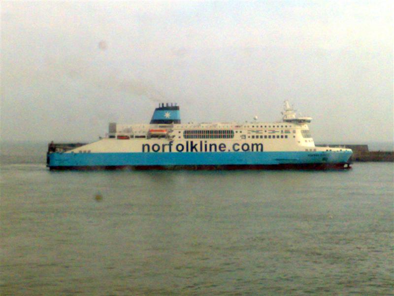 It will therefore come as no surprise that this typographical abomination caused me to squirm uncomfortably until it had passed out of view. What was interesting on this occasion was that my travelling companion (who by his own admission is to design what Jade Goody is to haute couture) spotted my flinches and acknowledged the heresy that was evident outside the ferry window immediately and required no convincing that this was not good brand portrayal and he too read it as "Norf-olkline" as the font metrics are completely wrong. (it acutally looked worse, if that is possible, outside the lens of my camera as the kerning between the o-l-k is also all wrong)
Norfolkline must be aware that this particular ferry has been "decorated" in such a way, but I am intrigued as to how it came to be so - it surely cannot be down to cost-saving, though I can understand that could be why it has not been corrected since. Maybe there is an opening for a position as Brand Manager!?
Ok, so, in the scheme of things and in comparison to world peace and global warming, this hardly needs a mention, but my point is that, with a small amount of care, the right communication to the contractors doing the painting, or a tiny amount of education as to what the company's brand stands for, this would surely have not happened?! I know that it's not what's on the tin, but what is in it, but we dont buy premium baked beans from a dented, scrawled wrapped can, do we..?
If a company cannot look after their own brand or present their products and services to to the best of their ability, how am I supposed to feel that they will they look after me as a customer?
Monday, 11 February 2008
Disability inconsideration...

Is this really how much space a marketing flyer can offer its disabled audience?
I find this quite appalling from both a design and usability perspective; I would like to think that the designers of this promotional flyer would surely not have promoted themselves or any element of the information within it at this size (I reckon the point size of the type is no more than 1 point, it doesnt even show against the ruler!) so why even bother?!
Is it an example of token disability conformance? More likely a total misunderstanding of what their audience need and want.
One of the most common usability issues that websites can address is that of improved readability, yet when it comes to print, few companies do anything about it. I get frustrated when we come across websites that have been developed that completely ignore usability and accessibility issues; it is not just about adhering to another set of guidelines (the DDA in this case), but because it demonstrates a lack of understanding (or consideration?) of who exactly the audience might be, and what they want and might need.
And, back to my point, the fact that this flyer was from the TFM&A (Technology for Marketing and Advertising event) is even more shocking IMHO.
Maybe one of the technologies I shall see at the event on Wednesday will be a hi-tech magnifying glass to read the aforementioned flyer!
Tuesday, 29 January 2008
Pats on backs
I'm not sure what the correct blog-i-quette is for self promotion, but in this case, I dont care!
Preview has been through a lot of changes and reorganisation over the past 18 months or so, and its all paid off in our new team and the work they've been doing.
To cap it all, I had another look at our 2007 yearbook today, that Martyn Reding (our Creative Director) put together, and it reminded me, it's blimmin great.
If you do nothing else, please take two minutes, pop over to our news page and have a read of THEIR yearbook - its worth it, honest!
Great stuff everyone - thanks, I'm really proud!

